Innovation Scientists is a consulting and software firm that works for Department of Defense (DOD). It is committed to advancing transformative research and technology. They work with public and private entities to rapidly assess and deliver impactful solutions, bridging cutting-edge innovation with real-world applications.
As a senior graphic designer, I partnered with Innovation Scientists to elevate their brand identity and create various graphics for presentations and their website.
Branding, Icons, Illustrations
As an essential part of their branding, I created a series of icons, illustrations, and graphics, background templates to be used across their website, presentations, and various other platforms. I employed the power of colors, shapes, gradients, and transparent shades to showcase Innovation Scientists' technological mission vividly.


Design Highlights
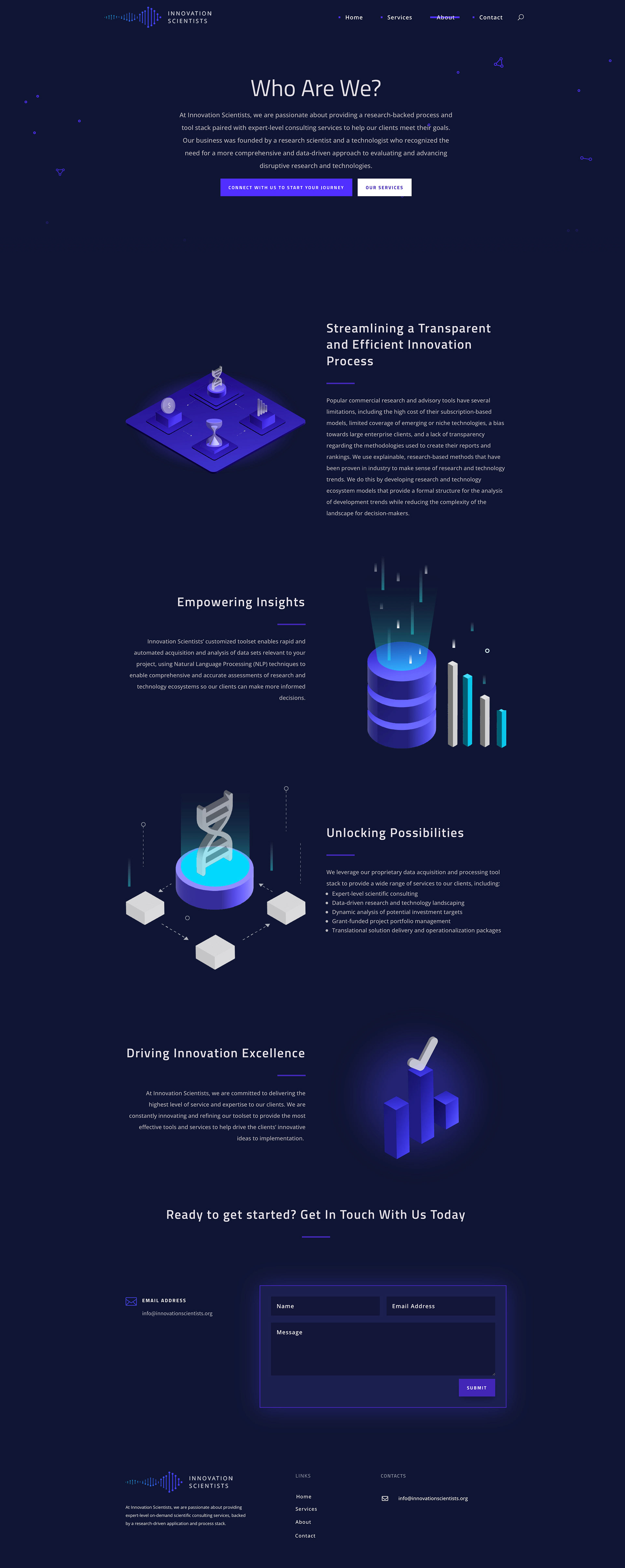
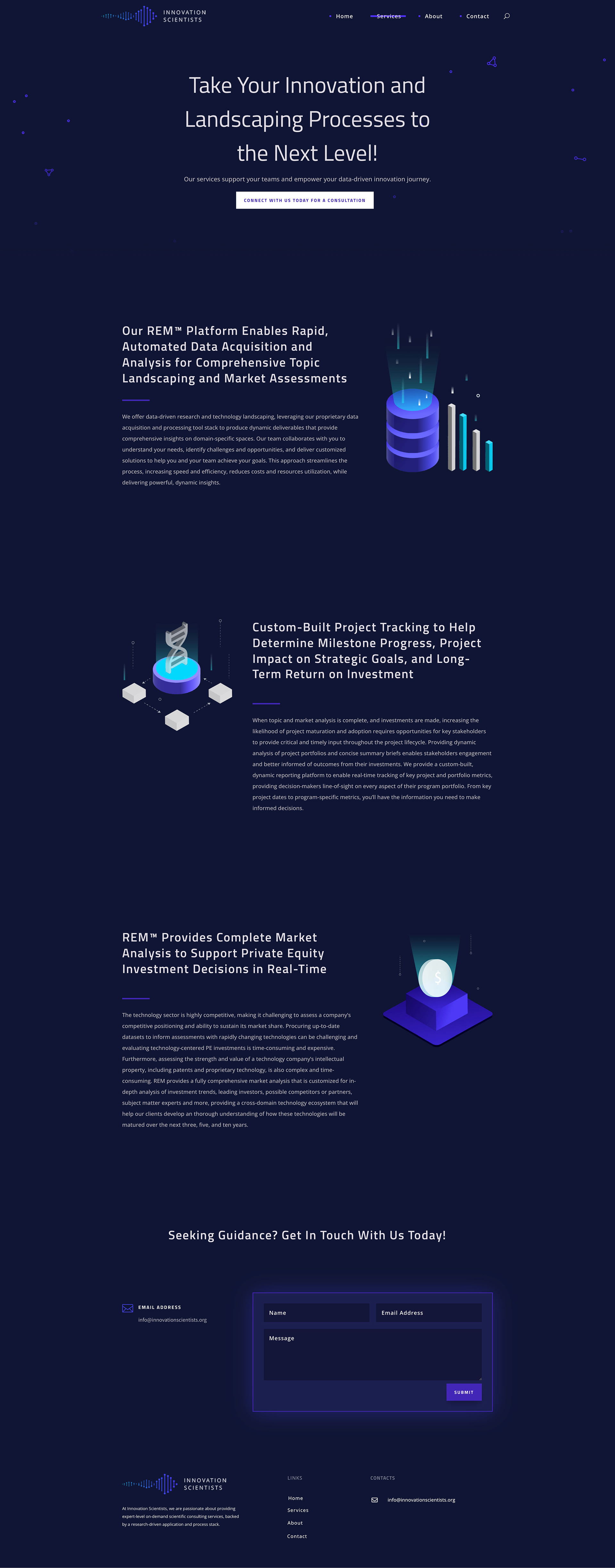
Website Design: I built their website from scratch, ensuring a seamless user experience with intuitive navigation and a consistent visual language.
Brand Identity: While retaining their logo, I enhanced their brand by selecting Titillium Web for its geometric, tech-driven appeal and Open Sans for its clarity and modernity.
Color Palette: I introduced shades of blue and purple to evoke a futuristic and technological vibe, aligning perfectly with their mission.
Custom Visuals: Designed icons, illustrations, graphics, and background templates to maintain platform consistency and amplify their technological narrative.
